Popular Destinations
Marquee-style destinations section with structured cards editable in the Visual Editor.
Popular Destinations
Explore the world with peace of mind
---
import PopularDestinations from "@features/popular-destinations/PopularDestinations.astro";
import PopularDestinationItem from "@features/popular-destinations/PopularDestinationItem.astro";
---

<PopularDestinations backgroundColor="none" colorScheme="inherit" eyebrow="" heading="Popular Destinations" paddingVertical="4xl" subtext="Explore the world with peace of mind" variant="default" />
---
blocks:
_component: page-sections/features/popular-destinations
eyebrow: ''
heading: Popular Destinations
subtext: Explore the world with peace of mind
items:
- _component: page-sections/features/popular-destinations/popular-destination-item
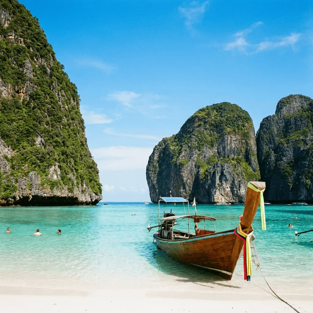
name: Bali
description: Tropical Paradise
imageSource: /destinations/bali.webp
imageAlt: Bali
href: ''
variant: default
colorScheme: inherit
backgroundColor: none
paddingVertical: 4xl
---Overview
Use Popular Destinations when you want a lightweight discovery band between denser sections. The content inside the marquee is currently static in the React component, so the section-level controls focus on spacing and theme treatment rather than individual destination editing.
Properties
eyebrow string
Optional short label above the main heading.
heading string | default: Popular Destinations
Main section heading (shown with globe icon).
subtext string | default: Explore the world with peace of mind
Supporting line below the heading (paragraph-level formatting in the Visual Editor).
items array | default: array
Cards shown in the scrolling marquee (first row is visually editable in CloudCannon).
_component string | default: page-sections/features/popular-destinations/popular-destination-item
name string | default: Destination name
Destination title on the card.
description string | default: Short tagline
Tagline under the title (inline formatting supported in the Visual Editor).
imageSource string | default: /destinations/bali.webp
Card background photo.
imageAlt string | default: Destination photo
Alt text for the image.
href string
Optional link URL for the whole card (leave empty for no link).
variant enum | default: default
Visual style preset applied to the section wrapper class.
-
default
colorScheme enum | default: inherit
Color scheme theme applied to the section wrapper.
-
inherit -
light -
dark
backgroundColor enum | default: none
Background color behind the destinations carousel.
-
none -
base -
surface -
accent -
highlight
paddingVertical enum | default: 4xl
Vertical padding applied above and below the section.
-
none -
xs -
sm -
md -
lg -
xl -
2xl -
3xl -
4xl -
5xl -
6xl